A Brief Exploration Of The Impact of Album Artwork
When Beyoncé dropped HOMECOMING, the official live album for her history-making Coachella set, there was something about the record that went largely unnoticed. HOMECOMING was Beyoncé's first album to have an unobstructed view of her face since 2011's 4. It sounds unbelievable but the regal Nefertiti-inspired portrait was our first look at Beyoncé's face on an album cover since 4's high-fashion photoshoot.

Columbia/Parkwood
Beginning with Dangerously In Love in 2003, Beyoncé's album artwork were largely glamour shots; her first four albums were all similar in that regard. It was in 2013, however, the year in which she transitioned into the second decade of her solo career, when her approached to album artwork changed. BEYONCÉ, the album that shifted the music industry, not only marked a new phase of Beyoncé's artistry, it was also her first studio album to not have her face on the cover. The iconic album cover is simply a pink, slightly off-center, and entirely capitalized "Beyoncé" against a jet black background. For the other studio projects that followed, each release followed the general blueprint of her 2013 eponymous album. 2016's Lemonade, the second-best album of the last decade, shows just the side of Beyoncé's head. 2018's EVERYTHING IS LOVE, a collaborative album with Jay-Z billed as "The Carters," had a cover that was a portrait of two of Beyoncé's dancers in front of the Mona Lisa. Finally, 2019's The Lion King: The Gift, a compilation executive-produced and curated by Beyoncé in honor of the 2019 remake of the classic film, featured two gilded lions chasing each other in a circle against a black background.


There are a couple of reasons why Beyoncé shifted to faceless album covers. Firstly, after five solo albums and sixteen years in the music industry, Beyoncé's brand was no longer directly dependent on her physical image. With each tour and acclaimed awards show performance, Beyoncé's brand evolved from a bombshell beauty/sex siren with a great voice to an accomplished dancer with an inimitable stage show. Even as the singles from 4 failed to reach the Top 10 on the Billboard Hot 100 or garner much traction upon release, her brand was stronger than ever. Post-4, it was clear that Beyoncé no longer had to rely on hit singles or her image to sell an album. The public knew who she was and trusted her artistry. Moreover, there's the conversation about critical acclaim and overall public perception. Alternative artists and indie bands rarely have their faces on album covers in the way that pop stars do. This definitely can be attributed to genre bias, but albums with glamour shots as their artwork are automatically perceived to be less "artistic" than albums with more detailed artwork. The correlation isn't necessarily valid, but there is no doubt that it exists to some extent among music listeners and critics. Beyoncé's self-titled album was the moment where music's mainstream caught up to her personal artistic renaissance. 4's commitment to an authentic R&B sound in the midst of the EDM boom set the blueprint for the fearlessness that BEYONCÉ and Lemonade would take to another level. With 4, Beyoncé progressed past the point of any regular pop star like the Katy Perrys or P!nks of the world. She achieved the general perception and acceptance that she was a "real artist" thus nullifying the need to attach her work to her physical likeness.
What is interesting, however, is that for Beyoncé's non-solo studio projects (EVERYTHING IS LOVE and The Gift), the lack of her face on the cover attributed to their comparatively lackluster commercial reception. BEYONCÉ and Lemonade both debuted at #1 on the Billboard 200 with over 600,000 album equivalent units. EVERYTHING IS LOVE debuted at #2 (behind 5 Seconds of Summer's Youngblood) with 123,000 units and The Gift debuted at #2 (behind Ed Sheeran's No.6 Collaborations Project) with 54,000 units. Now, between the lack of promotion, sneak attack/surprise release strategy, weak singles campaign, and limited releases, these albums had their fair share of obstacles to overcome. Nevertheless, one must wonder if having Beyoncé's image, or at least her name, on the album covers would have helped each record's overall performance.
In short, drastic changes in an artist's album artwork trend tend to signal a shift in focus (from commercial success to critical acclaim), or at least coincide with a major turning point in their careers. Let's take a look at a few (recent) examples:
Drake, Views

Republic/Young Money/Cash Money/OVO
With over 1 million units shifted in its debut week, 13 non-consecutive weeks at #1 on the Billboard 200, and five hit singles, Views is inarguably Drake's biggest album. Interestingly, all of Drake's solo studio albums (Thank Me Later, Take Care, Nothing Was the Same, Scorpion) have a clear view of his face on the cover. Views was Drake's clear shift from rapper to pop star. Home to songs like "Hotline Bling," "One Dance," and "Too Good," the album was Drake's gamble to compete with rappers and singers and beat everyone at their own game. And that he did. On Views' album cover, Drake is Photoshopped atop Toronto's CN Tower. With his physical being out of view, the focus shifts to how Drake the Brand is representative of the entire city of Toronto, hence the CN Tower occupying more of the frame than Drake's body.
Ariana Grande, Sweetener

Republic
Earlier in her career, there were multiple running gags about Ariana's album covers. Both Yours Truly and My Everything were black-and-white portraits of her with her eyes closed. When 2016's Dangerous Woman featured her with her eyes open, albeit still black-and-white, it was a big moment for her fanbase! Regardless, it was the the album cover for 2018's Sweetener that really changed the game for her. Not only was Ariana awake on this cover, it was her first non-black-and-white cover and it was upside down. Sweetener was album that garnered Ariana her first Grammy Award and her most glowing critical acclaim and solo single success (at the time). It is no coincidence that this new chapter in her musical career was marked by such a starkly different album cover. The upside down orientation of the album artwork is representative of her dysfunction and anxiety after the tragic bombing outside of her Dangerous Woman World Tour stop in Manchester. Furthermore, this was the first album where Ariana truly emoted sadness and pain in her music. She experienced a lot of trauma in her personal life during the making of Sweetener, and she turned that into some of the most beautiful audio therapy of the decade. Not to sound cliché, but she really stepped into the light on this record and the artwork is symbolic of that.
Nicki Minaj, The Pinkprint
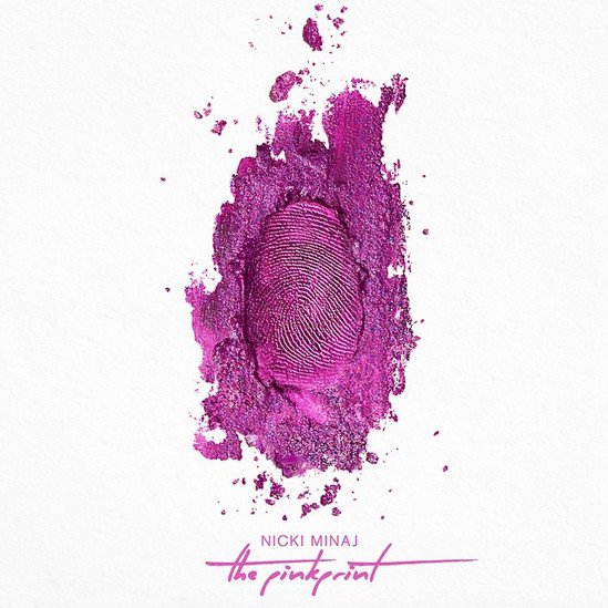
Republic/Young Money/Cash Money
Now that we're a few years removed, The Pinkprint is clearly the Nicki Minaj album that is most fondly looked upon. The emotional album was Nicki's last #1 album in the U.S., featured multiple multi-platinum singles, and garnered four Grammy nominations. For an artist whose body is so intrinsically tied to her celebrity, it is interesting that this particular record is Nicki's only album without her on the cover. The album cover features a fingerprint of dark pink makeup against a white background. Outside of her mixtapes, The Pinkprint is arguably the album where Nicki was the most personal. Past Nicki album covers featured her covered in neon paint, photoshopped into a Barbie doll, or in a gaudy regal costume. The comparatively simple album cover for The Pinkprint represents a stripping down (which was apparent in Nicki's overall look for the era) and the fingerprint is symbolic of her personal impact on the general blueprint of female rap that newer girls would follow just a few years later.
Rihanna, ANTI

Roc Nation/Westbury Road
Like Madonna, Rihanna has thrived in the music industry though her utilization of distinct album eras. The jet black hair cut of Good Girl Gone Bad, the fire-red curls of Loud, and the pixie cut of Unapologetic are all iconic in their own right. For her eighth album cover, however, Rihanna chose to commission Roy Nachum to create a custom piece of artwork. Here's a Vanity Fair album that explains the symbolism of the cover in-depth.ANTI is far and away Rihanna's most acclaimed album yet and it is also the longest-charting album by a black woman in Billboard 200 history. After the release of ANTI, many people finally started to view Rihanna as an artist and not just a pop star who spat out hit singles every few months. In a way, the choice to move away from a standard photoshoot for ANTI was akin to Beyoncé's choice to go with just text for her 2013 eponymous album. The avant garde album cover helped subconsciously promote the "artistry" of the album beyond the sonic elements of the release.
Lana Del Rey, Lust For Life

Interscope/Polydor
The reigning of queen of alternative music, Lana Del Rey, had a similar running gag to Ariana for her first few albums. For Born to Die, Ultraviolence, and Honeymoon, Lana had a similar melancholic dead stare into the camera. With Lust for Life, however, Lana finally smiled on her album cover. Obviously, the title warrants a smile, but the grin also marks a musical shift for Lana. Lust for Life was Lana's first album to have credited guest artists on the tracklist. With appearances from The Weeknd, Playboi Carti, Stevie Nicks, A$AP Rocky, and Sean Ono Lennon, the album fully realized the hip-hop and surf rock influences of Lana's past albums.
Adele, 25

Republic/XL
Like Ariana Grande's first two albums, Adele's 19 and 21 both had portraits of her not looking into the camera for their artwork. 25, however, had Adele staring straight ahead, her eyes piercing the souls of her audience. 25 wasn't a massive sonic shift for Adele, nor was it a new peak of commercial success (it did have her biggest first-week sales total). Regardless, there are specific tracks on the record that coincide with this major shift. There's "I Miss You," a dark and sexy ballad unlike anything Adele has ever put out before; "All I Ask," her first collaboration with a fellow major pop star (Bruno Mars); and "Send My Love (To Your New Lover)" her first truly upbeat radio single.
Taylor Swift, 1989

Republic/Big Machine
"Are you sure you want to put an album cover out that has less than half of your face on it?" That was the question that Taylor Swift's label lobbed at her when she presented 1989 to them. Obviously, 1989 is the most important album of Taylor's career so far. The record marked her official transition into the pop music market. It is also, to date, her only album to not have a cover that displays her full face. 1989 was the ultimate test of Taylor Swift the Brand. Without her face on the cover, she was trusting her audience to support her regardless of the genre she chose to pursue. With over 9 million album equivalent units in the United States alone and a Diamond-certified single in "Shake It Off," clearly her fans showed up and showed out.